Data Housing overview

Welcome to the homework assignment on the classic House Prices dataset from Kaggle! In this assignment, you will explore the dataset, visualize some of its features, and gain insights into the factors affecting house prices.
Objectives
- Understand the problem statement and the dataset.
- Visualize important features and their relationships with the target variable (SalePrice).
- Perform basic data analysis to derive insights.
Problem Statement
You are provided with a dataset containing various features of houses and their sale prices. Your task is to analyze these features to understand how they influence the sale prices and build a model to predict house prices.
Dataset Description
The dataset contains 81 columns, including the target variable SalePrice. Here’s a brief description of some of the important columns:
SalePrice: The sale price of the house (target variable).OverallQual: Overall material and finish quality.GrLivArea: Above grade (ground) living area square feet.GarageCars: Size of garage in car capacity.TotalBsmtSF: Total square feet of basement area.FullBath: Full bathrooms above grade.YearBuilt: Original construction date.YearRemodAdd: Remodel date.
For a full list of features, refer to the data dictionary.
Instructions
1. Data Exploration
First, let’s explore the dataset. Load the dataset and display the first few rows to understand its structure.
1
2
3
4
5
6
7
import pandas as pd

# Load the dataset
data = pd.read_csv('train.csv')

# Display the first few rows
data.head()
2. Summary Statistics
Generate summary statistics for the numerical features to get an overview of the data distribution.
1
2
# Summary statistics for numerical features
data.describe()
3. Data Visualization
Visualizing data helps in understanding the relationships between features and the target variable. Let’s create some visualizations.
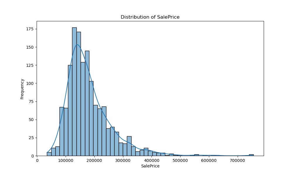
3.1 SalePrice Distribution
Plot the distribution of the SalePrice to understand its spread and central tendency.
1
2
3
4
5
6
7
8
9
10
import matplotlib.pyplot as plt
import seaborn as sns

# Distribution plot for SalePrice
plt.figure(figsize=(10, 6))
sns.histplot(data['SalePrice'], kde=True)
plt.title('Distribution of SalePrice')
plt.xlabel('SalePrice')
plt.ylabel('Frequency')
plt.show()
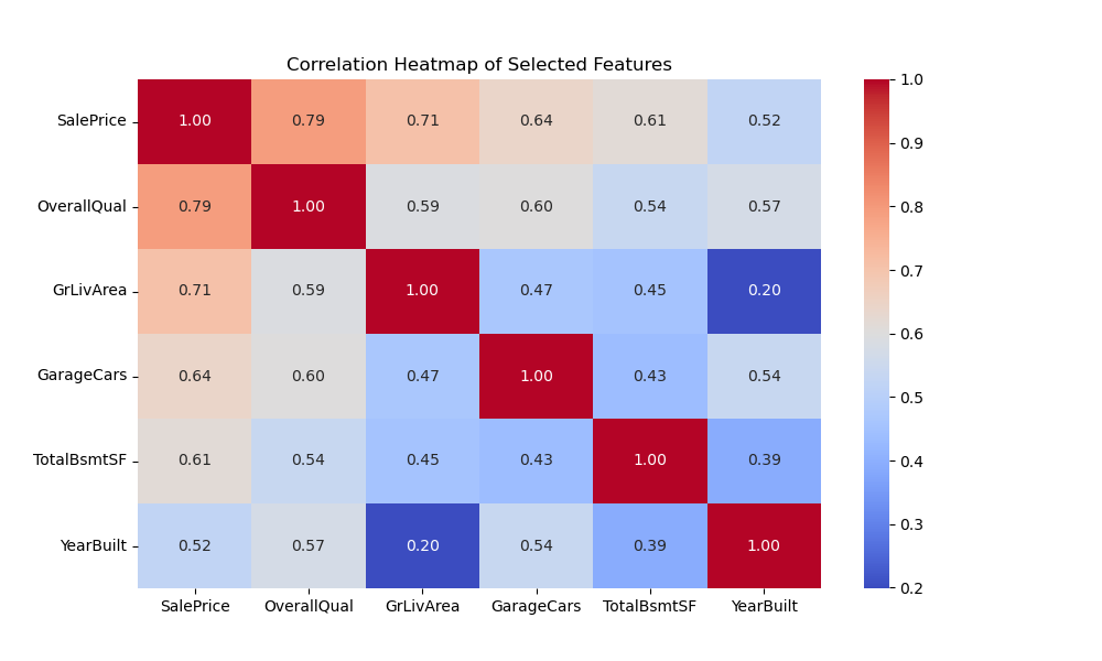
3.2 Correlation Heatmap
Create a heatmap to visualize the correlation between numerical features and SalePrice.
1
2
3
4
5
6
7
8
9
10
11
12
# Select the target variable and 5 numerical features
features = ['SalePrice', 'OverallQual', 'GrLivArea', 'GarageCars', 'TotalBsmtSF', 'YearBuilt']
selected_data = data[features]

# Compute the correlation matrix
corr_matrix = selected_data.corr()

# Plot the correlation heatmap
plt.figure(figsize=(10, 6))
sns.heatmap(corr_matrix, annot=True, cmap='coolwarm', fmt='.2f')
plt.title('Correlation Heatmap of Selected Features')
plt.show()
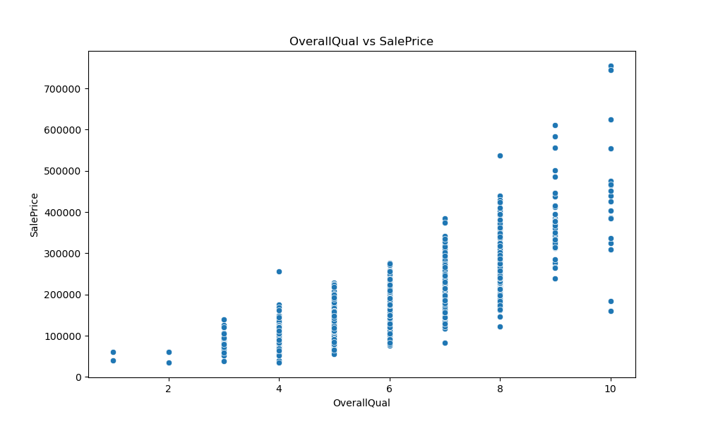
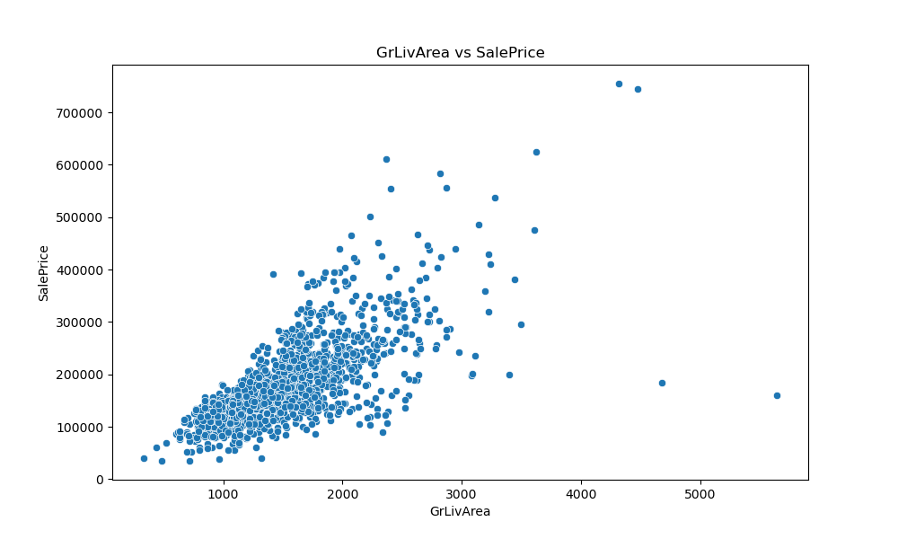
3.3 Scatter Plots
Generate scatter plots for some of the key features against SalePrice.
1
2
3
4
5
6
7
8
9
10
11
12
13
14
15
# Scatter plot for OverallQual vs SalePrice
plt.figure(figsize=(10, 6))
sns.scatterplot(x='OverallQual', y='SalePrice', data=data)
plt.title('OverallQual vs SalePrice')
plt.xlabel('OverallQual')
plt.ylabel('SalePrice')
plt.show()

# Scatter plot for GrLivArea vs SalePrice
plt.figure(figsize=(10, 6))
sns.scatterplot(x='GrLivArea', y='SalePrice', data=data)
plt.title('GrLivArea vs SalePrice')
plt.xlabel('GrLivArea')
plt.ylabel('SalePrice')
plt.show()
4. Feature Analysis
Analyze the impact of some categorical features on SalePrice.
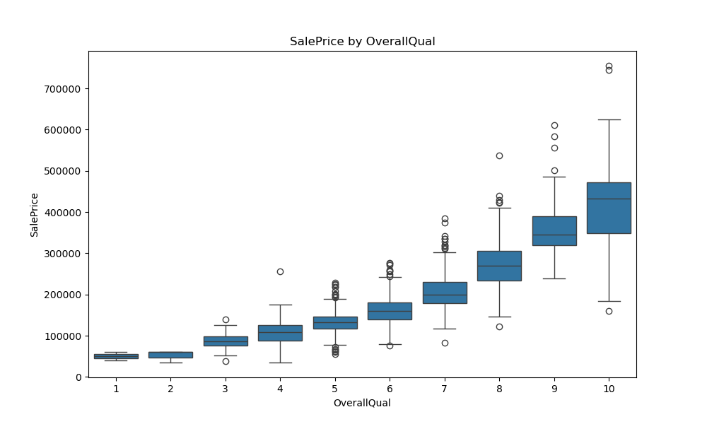
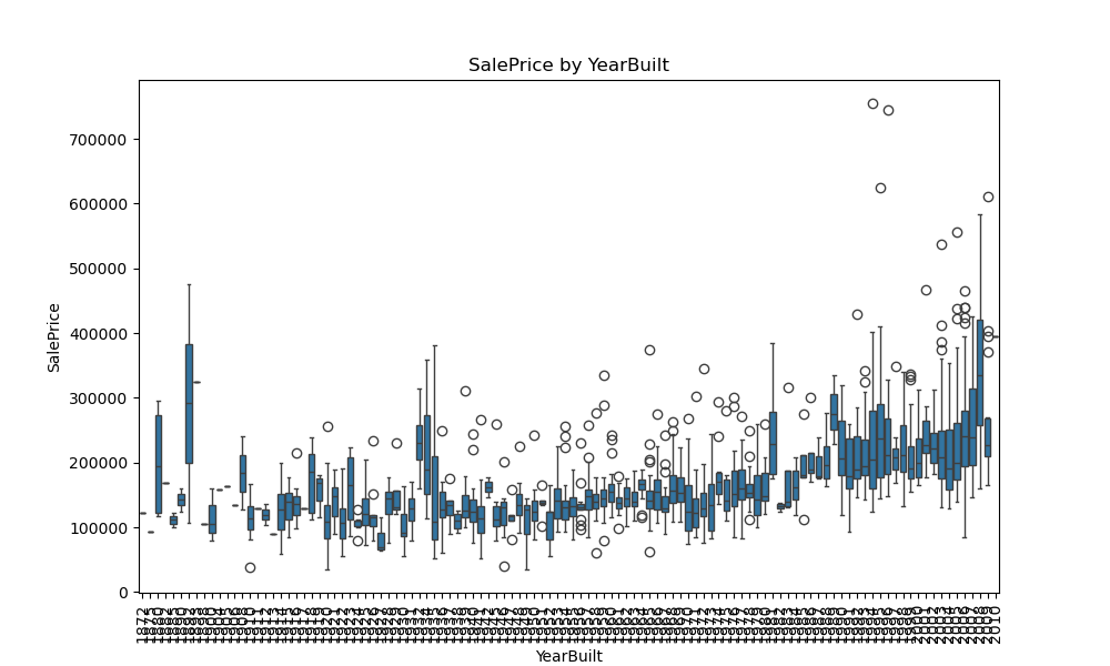
4.1 Box Plots
Create box plots to visualize the distribution of SalePrice across different categories.
1
2
3
4
5
6
7
8
9
10
11
12
13
14
15
16
# Box plot for OverallQual
plt.figure(figsize=(10, 6))
sns.boxplot(x='OverallQual', y='SalePrice', data=data)
plt.title('SalePrice by OverallQual')
plt.xlabel('OverallQual')
plt.ylabel('SalePrice')
plt.show()

# Box plot for YearBuilt
plt.figure(figsize=(10, 6))
sns.boxplot(x='YearBuilt', y='SalePrice', data=data)
plt.title('SalePrice by YearBuilt')
plt.xlabel('YearBuilt')
plt.ylabel('SalePrice')
plt.xticks(rotation=90)
plt.show()
Try It Yourself
Now it’s your turn! Answer the following questions by modifying the code snippets provided earlier.
- Generate a correlation heatmap for the following features:
SalePrice,OverallCond,YearRemodAdd,MasVnrArea, andFireplaces. - Create a scatter plot for
YearBuiltvsSalePrice. - Generate summary statistics for the features
LotArea,OverallQual,TotalBsmtSF,FullBath, andGarageCars. - Create a box plot to visualize the distribution of
SalePricebyFullBath. - Plot the distribution of the
GrLivAreafeature.
Try modifying the code and observe how the visualizations and summaries change with different features. This will help you gain a deeper understanding of the dataset and the factors influencing house prices.
